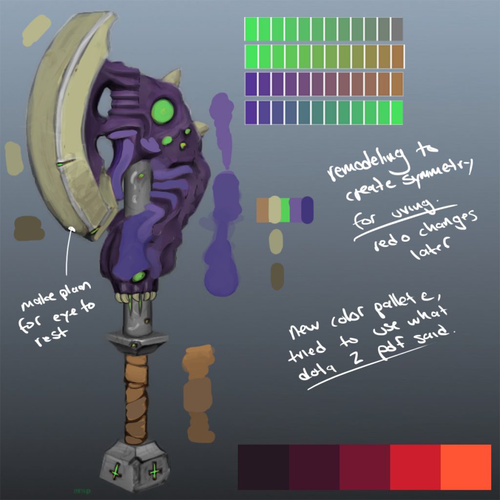
Well.. I learned a bit about color palettes’s for video games and how to not overload a user today, had some really helpful pdfs from dota 2 about character creation for a specific purpose. I use a lot of the same techniques but nowhere near to the extent that they are. Here’s my updated concept art, that will be fully rendered in a week. For this update, I created a less busy blade so the user has a place to rest his eye when things get too busy. I created gradients going from the bottom up to help ground each piece, I changed the color of the glow to be tertiary to my purple on the color wheel and the brown is also a blended tertiary color.

Leave a Reply